Sign Message Creation Tips
Today I am going to go over a few tips and tricks you can use to create great looking sign messages. These tips are generic in nature so that they can be applied to any software used to create messages.
Create in the Matrix
I know what you’re thinking, “The Matrix! I knew it was real, if only we had taken the red pill.” Wait, hold up, we’re not talking about that kind of matrix. The matrix I am talking about is the pixel matrix of your sign. This is the number of pixels high by pixels long on your led sign. The reason I recommend doing this is to avoid any un-planned stretching or squishing of items in your message.
Most Image and Video editing programs will allow you to enter dimensions when starting a new message. Just make sure when you enter these dimensions you switch the measuring unit over to pixels. If you forget this you will know immediately. Creating a message at 144 x 288 pixels is vastly different than 144 x 288 inches.
Contrast…Contrast…Contrast
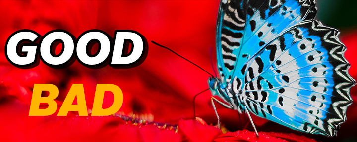
There is nothing worse than trying to read white text on a bright yellow background. The idea of a LED message center is not to strain the eyes of potential customers but to easily present your advertisements in a pleasing manner. The most basic rule of thumb here is, if you have a dark background, use light colored text. If you have a light background, use dark colored text.
Shadows and outlines can also help improve contrast between text and images in your messages. You can even combine an outline and a hard shadow to create a nice pop-out look on your text.
Furthermore, you can contrast more by use colors that are opposites. Bright Yellow text over a dark blue background or Bright green text over a dark magenta background. You know what they say, “Opposites Attract”. Well, when creating aesthetically pleasing messages, nothing could be truer.
The Theory of Color
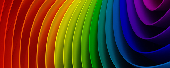
Wait what?! Color has theory? You betcha. Colors have a huge impact on how we operate as a society. Many of the ways we interpret color are developed at a young age. Lets just take moment to think about the color Red. What feelings do you experience when you see this color? Power, Passion, Excitement? These are just some of the feelings associated with red. This is what is known as an active color. It’s considered “active” because it is more likely to excite the mind and be perceived as a source of energy. In contrast, passive colors are more neutral and toned-down than active colors. They tend to promote mental focus, and often have a calming effect. Passive colors are associated with calmness, introspection, quiet, and comfort.
So, you might be wondering how you can incorporate this into your messages. Well if you’re looking to attract clients with a deal or special, use active colors to get them excited. If the desire of your message is to inform, stick with passive colors for easy reading.
Here is a brief breakdown of Active and Passive Colors:
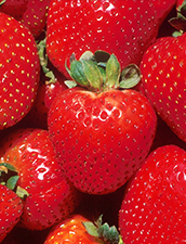
Red
Active or Passive: Active
Common Uses: Red is often used by restaurants to stimulate appetite. It also creates a sense of urgency, which is perfect for encouraging action or promoting a sale.
Emotional Associations: Power, passion, excitement, courage.

Orange
Active or Passive: Active
Common Uses: Orange is an aggressive color, so it’s ideal for making design elements like calls to action stand out. Be careful when using orange – if you use it poorly, it can make your design feel frivolous or juvenile.
Emotional Associations: Energetic, happiness, confidence.
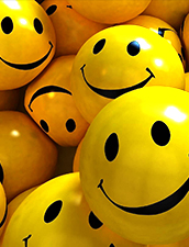
Yellow
Active or Passive: Active
Common Uses: Nothing compares to yellow’s ability to grab attention. However, use too much yellow and you run the risk of causing visual fatigue.
Emotional Associations: Optimism, youthfulness, friendliness.

Green
Active or Passive: Passive
Common Uses: Green is a very soothing color. Use green to evoke a sense of calmness and tranquility, or to symbolize nature or prosperity.
Emotional Associations: Wealth, relaxation, nature.

Blue
Active or Passive: Passive
Common Uses: Blue is widely loved, and is therefore a non-threatening, conservative color choice. It’s also a productive and non-invasive passive color, which makes it ideal for corporate communications.
Emotional Associations: Security, trust, communication
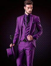
Purple
Active or Passive: Passive
Common Uses: Because of its association with royalty, purple is commonly used to create a sense of luxury. However, purple can also appear very whimsical, so be sure to use the right shade.
Emotional Associations: Creativity, wisdom, luxury
